There’s nothing like visiting a church only to be thrown into the middle of the service with no real clue on where the kids’ classes are, where the bathroom is, or even how you get more information about the upcoming Christmas Eve services. Whether your church is 200 people or 2000, basic church outreach says it’s important that visitors be made to feel welcome and have easy access to basic information.
So why would a church violate this policy on their Facebook page?
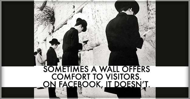
The default landing stop for a visitor to your church’s Facebook page is the “Wall”. This is where a first-time visitor tries to figure out what your church is all about, who the ministers are, and what kinds of activities your church has for their 3-year old, 3rd grader and their Middle Schooler. And, no, the “Wall” is not how to find that information out. It’s like jumping into the middle of a conversation and trying to just decipher what’s going on. This is the absolute worst kind of church Facebook page.
I’ve got a few questions to ask you:
- Wouldn’t it make more sense to greet your guests with a friendly video message?
- Wouldn’t it be nice to be able to show your guests a 2-minute video of what to expect on a Sunday morning during the Children’s Worship? Or to show them your upcoming holiday schedule for Christmas Day?
- Wouldn’t you rather have the opportunity to point your Facebook visitor to the church’s podcast to get a flavor for the minister’s preaching, or to your church’s video channel to watch the 11th graders on their mission trip to Brazil?
- The “Wall” is like a maze for a visitor. You are leaving it all up to them to scroll through your history of random postings or to take the time to click on the info tab to visit your website. Why not just point them to some obvious places where you know they need to visit to understand the heart of your church?
- The default “Wall” is as bad as being satisfied with back-row visitors never getting talked to and leaving without ever plugging in. Wouldn’t it be better to capture them into your Facebook stream database so that they can hear more about your church in the days to come? Driving them to that critical action step is as important in social media as a follow-up email or phone call would be to a first-time visitor to your church.
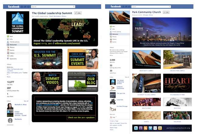
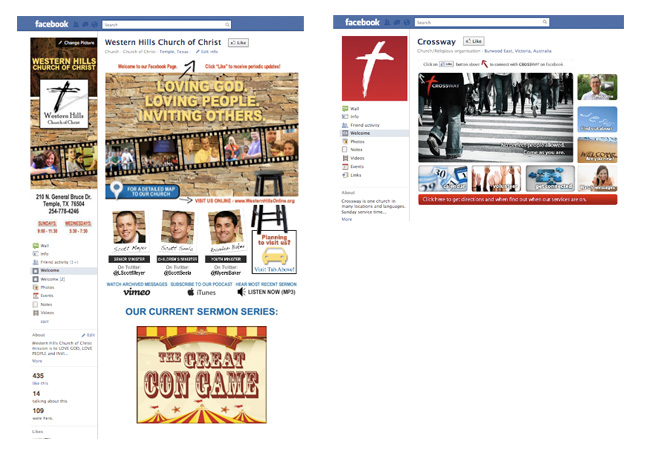
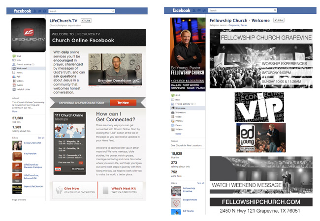
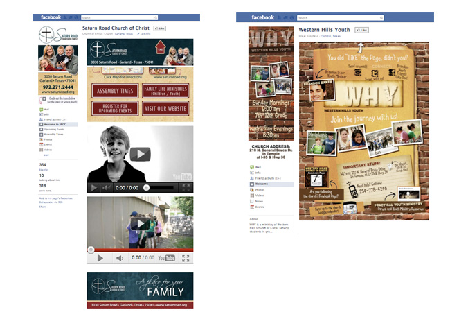
Below you’ll see a sampling of custom Facebook landing pages that intentionally deviate from the default “Wall”. These churches have decided to give first-time visitors a strong first impression that guides a guest to the areas that the churches want these newcomers to see. Prompting guests to “LIKE” your page is a critical action step, but you can go even beyond this by directing them to other areas of your Facebook page or to important pages on your website.
Don’t settle for default. The “Wall” is an unacceptable greeting for your church’s visitors. View the samples pages below that we have done for some of our church clients or that we have found around the web.
Before you go, read these from the archives:
- Churches and Facebook – What’s the point?
- 7 Easy Things for Churches to Do on Your Facebook Page before Christmas
CLICK ON IMAGES BELOW FOR LARGER VIEW
